Paytient Calculators
A dynamic, interactive calculators designed to make Paytient's value proposition instantly personal, built for web and extended to mobile.
Product Design
Marketing
UI & UX
Visual Design
Branding
Project Overview
Client: Paytient
Industry: Healthcare Benefits / Fintech
Timeline: Several days
My Role: Visual Designer & Developer
The Problem
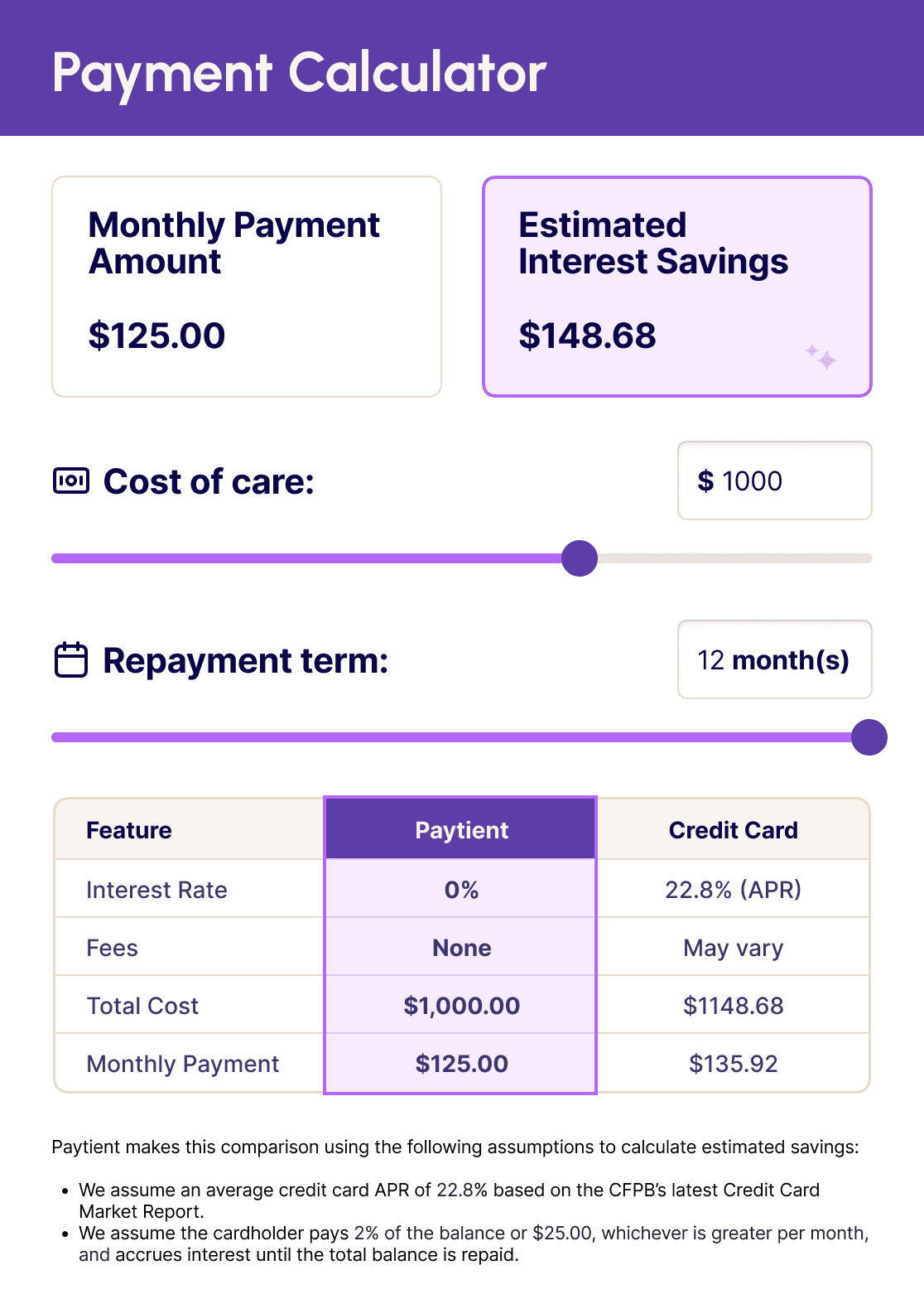
Paytient's core value proposition is genuinely compelling: pay for healthcare over time with zero interest. But explaining it in static copy wasn't converting. People needed to feel the math themselves. A $1,000 medical bill sounds scary in the abstract. Seeing that it breaks down to $125 a month with $148 in interest savings compared to a credit card? That lands differently.
The challenge was twofold: design a tool clear enough for anyone to use instantly, and build it functional without a traditional design-to-dev handoff.
The Approach
I designed the calculator from scratch in Figma, then used AI-assisted development to bring it to life directly, skipping the handoff entirely and giving me full control over the interaction details. The result was a fully functional, embedded web experience built to feel like a natural extension of the Paytient brand: clear, calm, and trustworthy.
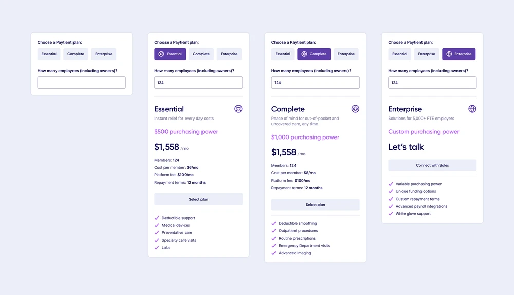
Two inputs drive the experience: cost of care and repayment term. Both use sliders so the math updates in real time as users interact. The results, monthly payment amount and estimated interest savings versus a credit card, update live at the top of the screen. A comparison table below gives the full picture at a glance.
The entire tool uses the same type system, color palette, and visual language as the rest of the Paytient site. It does not look like a widget. It looks like Paytient made it, because it did.
Extending to Mobile
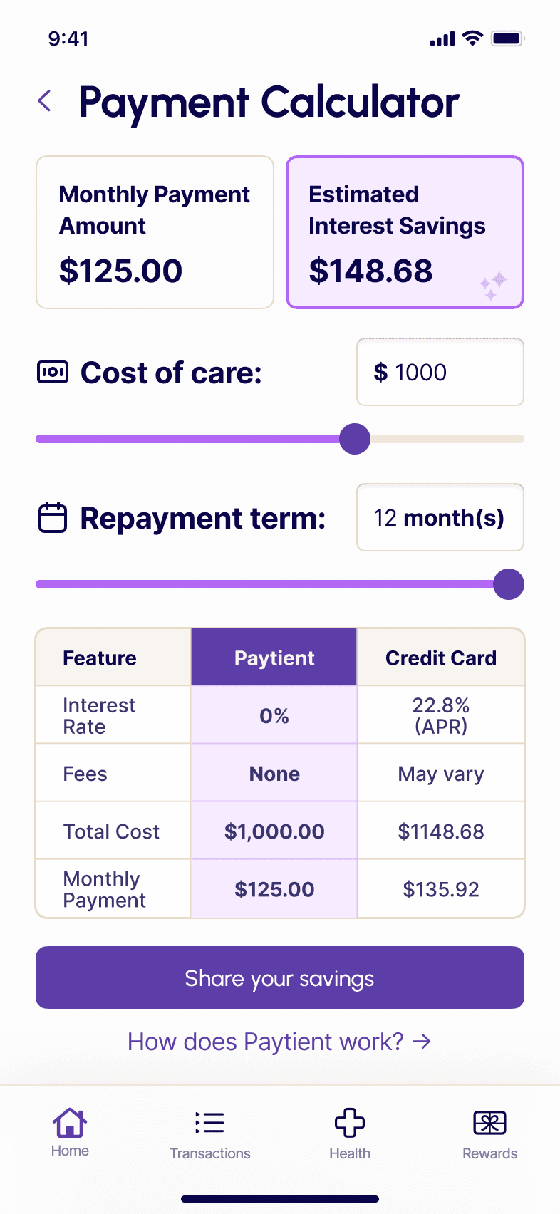
The original calculator was designed as a desktop web embed. Extending it to mobile meant rethinking the layout without changing the interaction model. The sliders stack vertically, the result cards go full width, and the comparison table adapts for a narrower viewport. The experience feels native to mobile rather than a scaled-down version of the desktop tool.
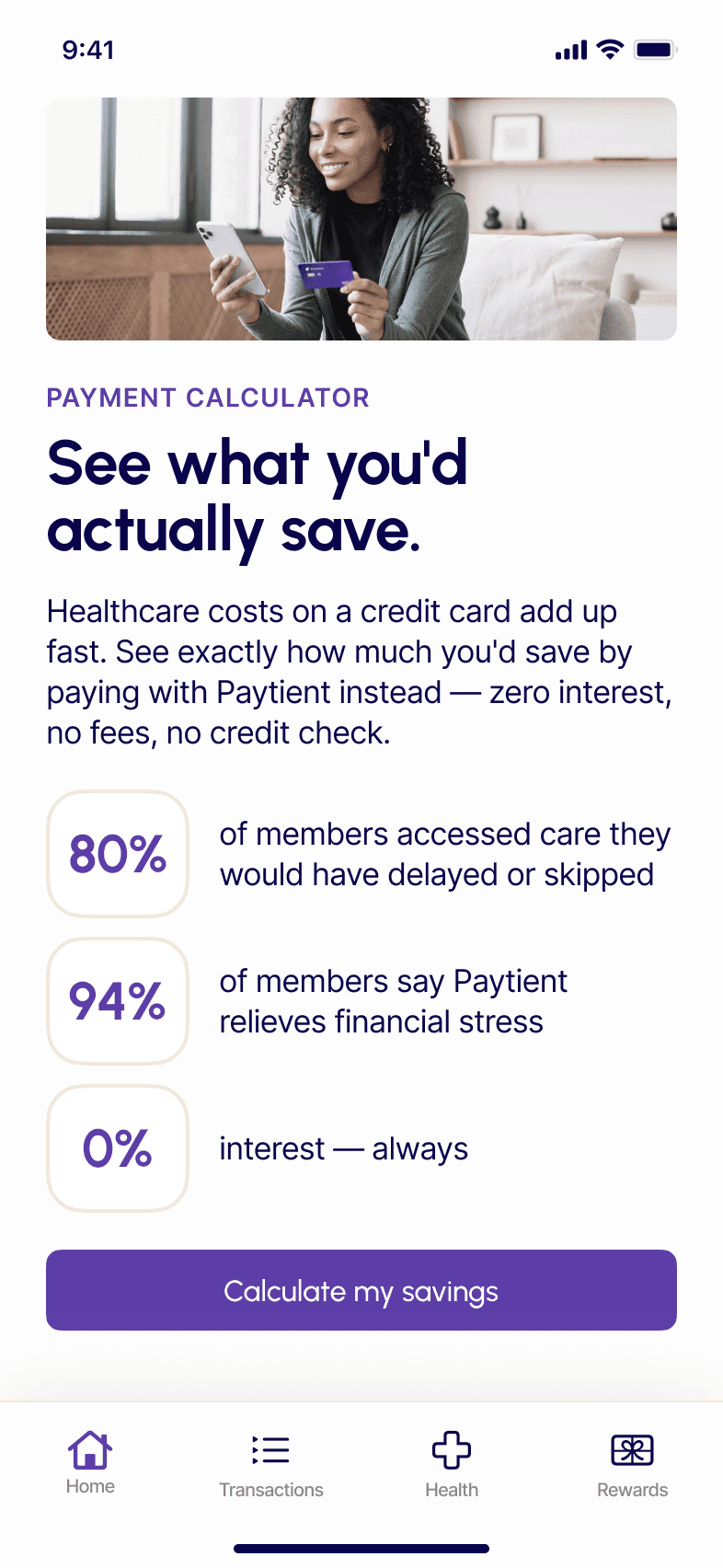
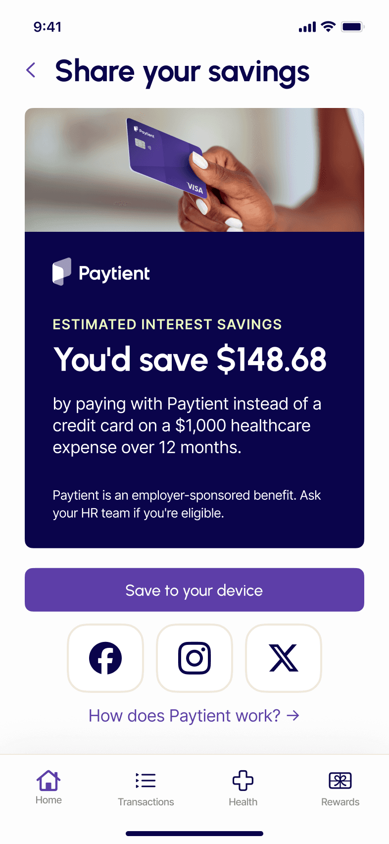
Three additional screens complete the mobile flow: an explainer screen that contextualizes the tool with real member impact data before the user engages, the calculator itself with live-updating results, and a shareable savings card that lets members save or share their personalized result to social media or their device.
The Result
The calculator was tied to an email campaign targeting prospects and existing members who had not fully engaged with the product. It drove Paytient's highest email engagement numbers and meaningfully lifted conversions. People were clicking through, using the tool, and converting at a rate that exceeded what static content had been doing.
The on-brand execution mattered as much as the result. A lot of conversion-driven design trades visual quality for performance, and the brand erodes a little every time that tradeoff happens. This one did not.
What I Learned
Using AI to bridge the gap between design and development changed how I think about the role of a visual designer. The ability to go from Figma to a functioning product without a handoff means tighter feedback loops, more intentional interaction decisions, and a finished product that matches the design intent exactly. It is a skill I now bring to every project.